1
Problem & Goals
2
Problem & Goals
3
Problem & Goals
4
Problem & Goals

Your Majesty Cooks

PROJECT Summary
Despite being some of the most used websites on the internet, cooking sites tend to be pretty frustrating to use. Most people know about the wall of SEO text disguised as a personal story. But even after you pass this content, the structure never seems to take into account the experience of cooking from a device.

YM Cooks is a project I took on while working at Your Majesty. My goal was to create a highly usable cooking site, that optimised cooking experiences from the recipe discovery stage to the cooking and creation phases. The end goal was to create a digital cookbook that was just as delightful to use as it is to look at.
Roles

UX/UI Designer
Visual Designer

Contributors

This was a personal project I took on at Your Majesty.
  
Special thanks to Gabrielle Carlson, Henriette Brück, and Sebastien Dancer-Michel, Magnus Löwing for all your input and feedback.

PROJECT Summary

What are the problems with cooking sites?

Cooking websites are rarely designed with the user interests mind leading to a subpar user experience.

Import information is buried at the end of long scroll pages, disorienting users while simultaneously serving distracting and often unnecessary information at inconvenient moments.

This structure also forces users to continually interact with their device, which in the kitchen can mean getting mess and gunk on to phones, laptops and tablets.
PROJECT Summary

What are people's goals on cooking sites?

To identify the most relevant goals and opportunities, I conducted a customer journey mapping exercise, using insights from interviews and secondary research as the basis for the map.

I found that users of cooking sites have a number of diverse goals, spanning from cooking a meal from start to finish to finding inspiration for new dishes.  
PROJECT Summary
The discovery phase revealed insights and opportunities that formed the basis of the product and design goals and led to a core, guiding principle: you can more effectively provide information different user segments by splitting the site into two parts - discovery/decision making and cooking process.

Users who visit the site for the decision oriented reasons (choosing what to make, evaluating feasibility, etc) have different needs than users who are using the site to provide specific instructions for cooking.
PROJECT Summary

Defining clear product goals.

This discovery process led to the creation of these 3 core product goals which I used to guide the design process.
01
Serve the right information to meet distinct user goals at the most appropriate stage in the process.
02
Make the site eye-catching without sacrificing important information and ensure the site is easy to use and read.
03
Make it as hands-off as possible while users are at points when users are most likely to be actively cooking.
PROJECT Summary

Make decision pages unobtrusive but highly visual.

Decision-making pages needed to highlight desirable imagery in addition to being good to use on all devices. Because the content is already highly visual, I kept the design simple and unobtrusive to ensure pages didn’t become too busy and there wasn’t any obfuscation of important details.
PROJECT Summary

Decision pages needed to answer user’s most important questions.

Through the research phase, I found that users had 3 core questions that would inform the decision to make a dish:  
  • How long will it take to make this dish?
  • How difficult would it be to make this dish?
  • What are the core ingredients I need to make this dish?
The recipe flow was designed to answer those important questions and provide additional context for users. By prioritizing user needs and keeping information streamlined, users can quickly identify the recipes that best suit their preferences.
After clicking on a recipe, users are directed to the recipe page, which features a more detailed description, a full list of ingredients, and a list of necessary equipment. This information allows users to make an informed decisions and provides them with the necessary tools for preparation.

For instance, the page includes a "copy ingredients" button that allows users to easily copy the ingredients list to plain text, making it simple to create a grocery list with a single click.
PROJECT Summary

Use iconography to highlight important information.

The site utilizes iconography to highlight essential information, both within recipe descriptions and cooking instructions. To ensure simplicity and consistency, circular shapes form the basis of most icons.

Each shape was then carefully modified to convey a symbolic meaning, such as a bullseye for difficulty or a clock for timer.
Recipe iconography is used to emphasize crucial details, including temperature and timing instructions, as well as to indicate that only a portion of an ingredient should be used at a specific step, with the remainder reserved for later use in the recipe.

Hovering (or clicking on mobile devices) reveals tooltips, which can assist novice users in quickly understanding any unfamiliar symbols.
PROJECT Summary

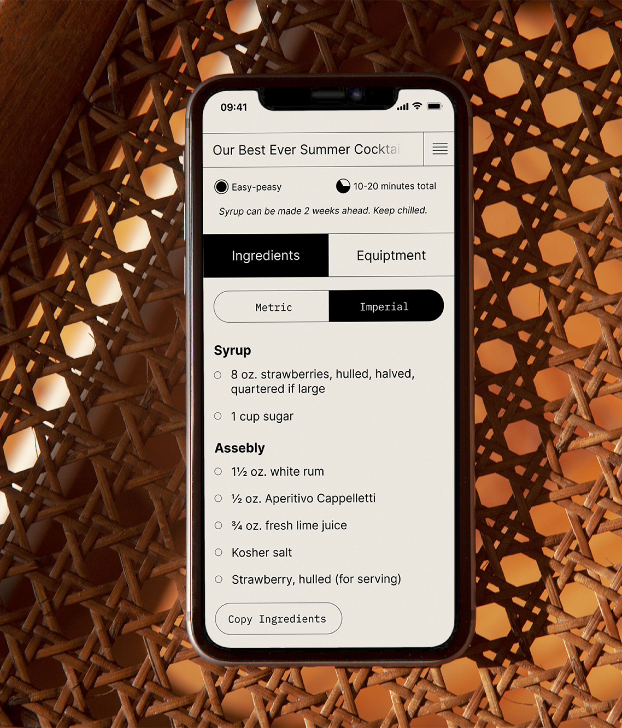
Recipe pages built for how people cook.

Recipe pages have a minimal design that enables users to focus on cooking without distraction. In-text formatting, like bolded ingredients/amounts and underlined equipment, makes recipes scannable, providing users with the foresight to quickly identify needed items.
The recipe page displays the ingredients and their amounts both within the text and in a separate list. The page's adjustable margins enable the ingredients menu to be visible while cooking if a user chooses to keep it open.
PROJECT Summary
This approach provides an option for all users to access the ingredients both contextually and in a separate list - which can offer a sense of comfort and convenience to some users who are used to using separate ingredients lists.